Well HELLO! I know it's been awhile since I've written! I didn't mean to take time away, but we were busy making memories before our kiddo went back to school. (SIXTH grade people!!) I was also working my butt off on the powder room makeover that I started uhhhh...five months ago? I'll tell you why it took me so long to finish this up in a bit. But it's done and I'm so excited to show you!
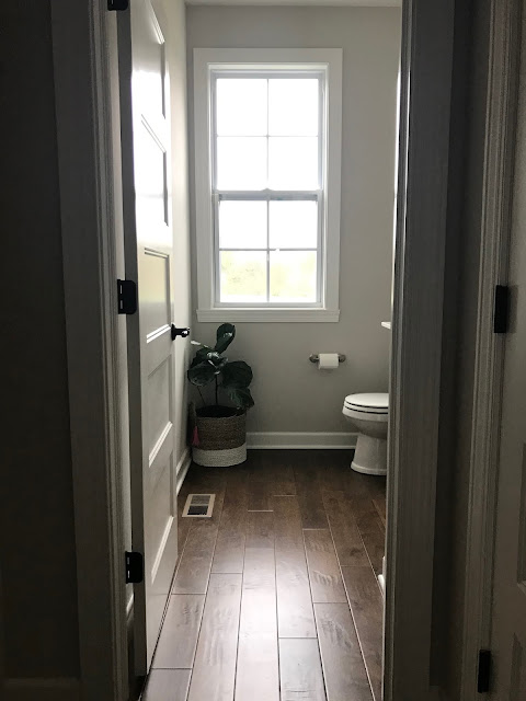
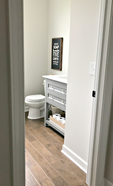
First, a look back at how this room looked when we moved in. This was the first room I shared with you in our new home. I had it somewhat put together within a week of moving in, but it's the smallest room so don't give me too much credit:
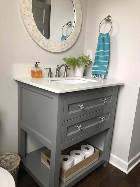
The basics were there -- a beautiful vanity and light as well as the awesome hardwood floors. This wasn't nearly as intensive as my powder room makeover in the last house.
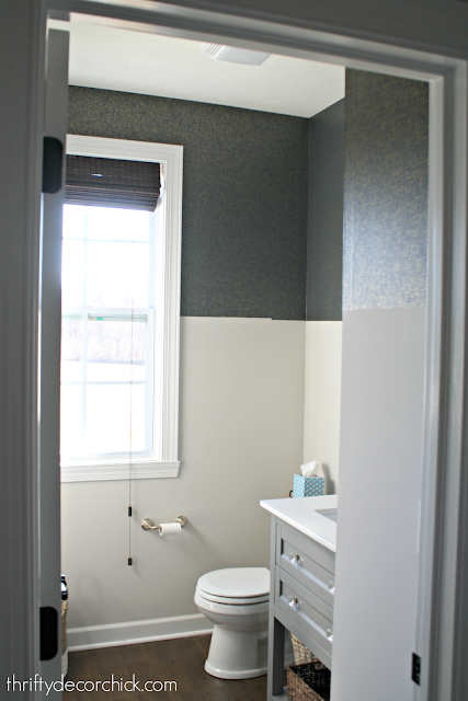
But I knew I'd want to add my touches to the room! I started with the pretty navy and gold wallpaper around the top of the room:
What's great is this stuff isn't regular wallpaper -- it's like contact paper and I found it pretty simple to install. You can see my tips on how to hang peel and stick wallpaper here.
I LOVE a painted ceiling and especially love them in smaller spaces. I used leftover paint from another project to paint the ceiling in this room:
I forgot to mention we had crown installed too. I hired out that part because I loathe hanging it.
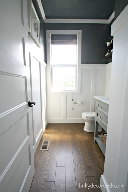
I know many of you questioned my vision for this space, which is not unusual. 😂 It's hard to envision what I have in mind sometimes. I'm happy to say this room came together just as I had hoped! I LOVE IT!:
I did a very simple board and batten treatment on the wall -- check out that link to see the step-by-step instructions on how to get look!:
The board and batten is why I kept putting off finishing this room. I knew I'd need to remove the baseboards to get the look I wanted. You can leave them and put this stuff above it, but I much prefer having the matching trim along the bottom instead.
I get this trim from Lowe's and it's called general purpose mdf -- it comes primed and has rounded corners already. It's so great for this project! I used a thicker one on the bottom and thinner boards for the verticals and around the top:
Side note -- when I use this mdf stuff I prefer not to use quarter round. I'm not a big fan of quarter round anyway, and I think it looks cleaner without. It's just a personal preference! (And I love that it saves me time too.) ;)
Also, mdf is OK for bathrooms as long as it's sealed with paint. Of course if we ever had a major water issue we may need to replace the base, but as far as water splatter, it holds up great.
I usually add a topper piece around the top of my board and batten, but I like this without it -- this is a more modern look with the dark wallpaper, so the simpler the better:
Speaking of that -- I LOVE the contrast in here! The contrast of the more modern gold flecked wallpaper on top and the white traditional board and batten on the bottom makes me happy.
When I got the board and batten up and stepped back to look at the room, I got a weird sensation of "this feels like home." It was an odd thing because this house has felt like home since the day we walked in it, and I've added plenty of my touches to the house already.
But this room really feels like US. It looks like it belongs in our home...and it was a great feeling. Almost comforting. This project really felt like a personal stamp on this new house. :)
As you can see, I went high with the wall treatment. You can do this at a lower height too! I just love it like this. I find either about a third of the way up or a third of the way down the wall is a good placement:
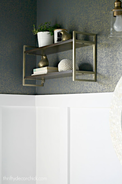
I had planned to hang that shelf (I'll list sources at the bottom of the post!) right above the toilet, but it felt tight and in the way. I have a thing with stuff above toilets -- they have to be just right or it feels like we'll hit it on the way to sit. :)
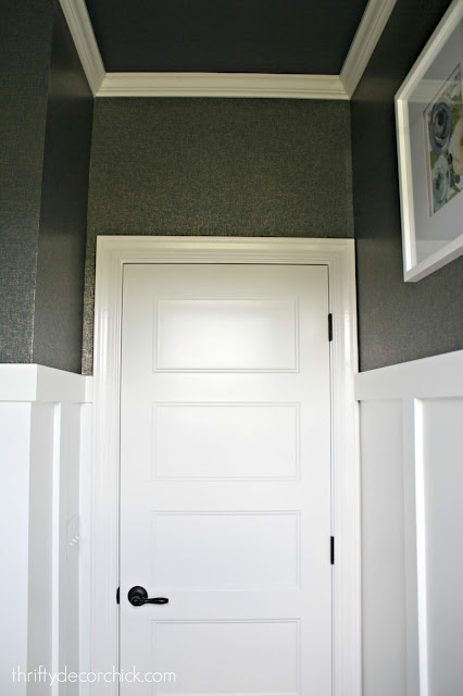
Board and batten at this height is a little different because art needs to be hung higher. I find simpler is better. I added a couple frames on the other side of the room:
I filled them with printables from Etsy sellers -- a super easy and cheap way to do art! I would have loved to have three of those frames but I already had these. Maybe I'll find a third someday. :)
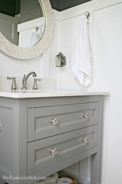
I bought the mirror months before I even knew what I wanted to do with this room, but I love that it has some gold tones that work well with the wallpaper and accents:
One thing to note in this room (and all of our rooms!) -- there is not one metal finish throughout. I get questions about that a lot! I think it gets a bit boring when EVERY finish is the same. Your light fixtures, faucets and accents do not have to match. It's all personal preference!
I like to add a little quirk to each space, and when I saw this sign at Target I had to have it:
I think it's fun to add at least one not so serious item that will make someone smile.
I spaced out my boards quite a bit in here. Since it's a small room I didn't want it to get too busy. These are spaced out about 22 inches on the longer walls. Where the walls are smaller, I just centered them:
I realized after I was celebrating this room being DONE that I never painted the crown molding. 😭 I swear no matter how hard I work on a space there's always something still left to do. Never fails.
Here's another look at the pretty wallpaper!:
And here are a few more detail shots of the room!
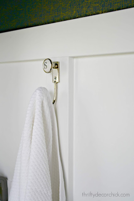
I took this hook from the powder room in the old house since they were replacing it with a different initial. ;)
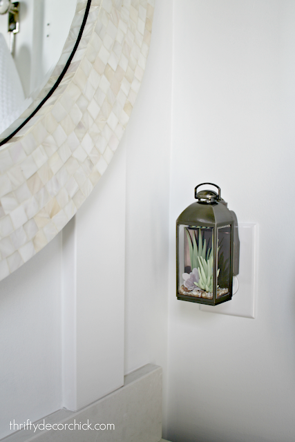
I saw this cute air freshener online months ago and ran to the store that day to see if they had them...I got the last one. Isn't it adorable?:
I have to finish off the tour with a before and after of course!:
I hope you enjoyed the tour! This is the first room I've completely transformed and I couldn't be happier with it! I mentioned months ago that I wanted it to feel like a little jewel box and that's how it feels to me. But it's still bright and fresh and we just love it.
Here's a list of sources and projects! Affiliate links are used for your convenience. If I forgot anything you're wondering about, please let me know:
- Frames and mirror, HomeGoods
- Plug in, Bath and Body Works
- Printables, Etsy (left one here, right one here)
- Hanging shelves, Target
- Flush sign, Target
- Similar light fixture
- Initial towel hook, World Market
- Peel and stick wallpaper, Target
- Soap dispenser, Target
- Vanity hardware, Amerock
- Painting a ceiling
- How to install peel and stick wallpaper
- Board and batten installation tutorial
- DIY men and women bathroom sign above door




Comments
Post a Comment